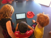
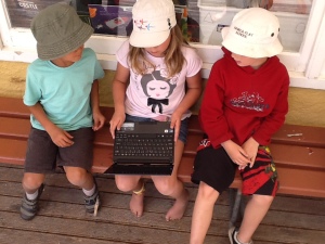
Every primary classroom studies statistics several times a year and when it comes to graphs you go through the process: surveys, tally charts, pictograms, bar graphs,
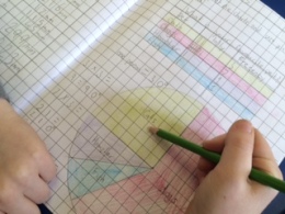
column graphs, line graphs, stem & blah, blah…
I am one of those who gets their students to make pretty graphs based on a a survey (favourite pet or book or blah..) and I have known for years that it is just going through the motions. The students learn skills (using a ruler, counting hands up in the classroom and colouring in a chart), but do they make any understandings? Maybe you integrate ICT and have a play with Excel, but do they make any connection to the real world or see statistics outside their classroom?
NOTE: Every class I have ever taught has loved making graphs – ruling them, colouring them and presenting them with a couple of comments on what they think the graph is telling them – and I love the lesson as well. I am just being a bit of a devils advocate with the previous paragraphs, not slandering every amazing teacher who gets their class to make a graph.
So, how do we take a classes questions and ask them to the world? How to we make a survey or questionnaire that has a sample size more than the number of students in your class? The answer is a Google form with some assistance from Twitter, Facebook, Email and a few forceful requests for friends to share the form and off you go.
We created the form from a whole lot of ‘random questions’ (this is how they have been described by many of those who have answered the form) and when the students went to get on the bus at the end of the day I began the sharing process. It did take begging in some cases, but only a few times and by the morning we had almost 200 responses and by our Numeracy lesson we had 250 responses.
The first 30-40 minutes of the Numeracy lesson began an animated discussion full of predictions on what we thought each questions results would be and then pondering why we were so wrong on almost every question. Additionally, as we reviewed the results 10 more people somewhere in the world answered the survey.
They said things like…
Why are the amount of Arabic speakers the same as the amount of Maori Speakers?
-I think Facebook might be banned in a lot of Arabic speaking countries.
-There are Maori speakers because Mr Dyer is from New Zealand.
-I just think that not many people who speak Arabic have seen the survey…
…and maybe if they did the could not read it because it was in English?
Why do over 60% the people answering our survey wear glasses or contacts when less than 10% of our class do?
Why are most of the people who answered Women? Is it because they use more social media or because they take more time to help people?
Why do only a few people like Orange… it’s my favourite colour?
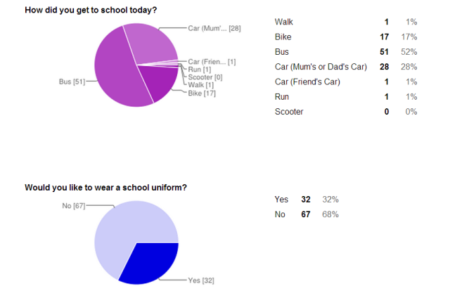
66% of people take a car to work or school – that is two out of three people… That is bad for the environment.
Wow, a lot of people believe in Aliens!
We then looked at different types of questions and discussed how we normally write closed questions, but by giving an open question like “What is your favourite food?” we get to see how truly different everyones choices are, but when we asked closed questions with a yes or no answer or only a few options it does not always give the person taking the survey the option of answering as they would like.
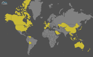
At the end of the first 24 hours my tech savvy and like minded teaching assistant took the data and turned it into a visual world map. Places in yellow are where we have reached already.
So now, after 3 days of the form being online we have reached just over 500 participants and we see the statistics beginning to even out to what we originally predicted. Hopefully over the weekend we will get more participants and as it spreads we may reach across to more parts of Africa or South America. So, next time you are studying statistics and want your class to get a better understanding of analyzing data give a Google Form a try and use all those social media contacts you have to see how far you can spread your questions.


